Effective Quantum Efficiency as I calculate it is an estimate of the probability that a visible photon – from a ‘Daylight’ blackbody radiating source at a temperature of 5300K impinging on the sensor in question after making it through its IR filter, UV filter, AA low pass filter, microlenses, average Color Filter – will produce a photoelectron upon hitting silicon:
(1) 
with  the signal in photoelectrons and
  the number of photons incident on the sensor at the given Exposure as shown below.

It has mainly comparative value but it should be acceptably accurate for photographic purposes because the numerator can be estimated thanks to Photon Transfer and the denominator can be calculated with a few assumptions. The main sources of inaccuracy are in the denominator, namely the actual Spectral Power Distribution of the illuminant, the average wavelength allowed through by each CFA and the measured Exposure value.
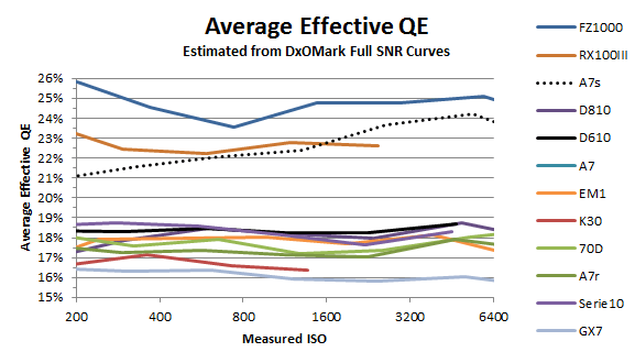
However if the illuminant and Exposure meter are the same we should be able to compare figures across sensor generations and brands as long as the average energy of photons under each CFA filter is similar. DxO takes their measurements using calibrated ‘daylight’ lamps and light meters, so I don’t feel too uncomfortable showing the comparative graph below obtained from their Full SNR curves. They represent an average of the individual EQE of the four raw channels. You can read more about how Effective QE is calculated here .
Peak (absolute) Quantum Efficiency
Peak QE on the other hand attempts to estimate the value of the absolute Quantum Efficiency at the peak of the curve:
(2) 
Think of  as the peak amplitude of the aggregate sensitivity function of the sensor and
  as its power (the area under the curve). Beware of average values approaching or surpassing 100% though, which indicate something went wrong in the data collecting chain.
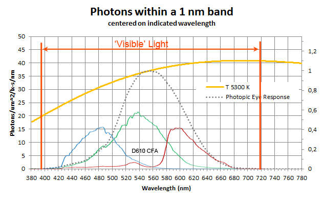
The underlying theory is the same but makes slightly different assumptions, the two main ones being an illuminant with flat spectral energy distribution; and that the shape of the spectral response under the average CFA filter is the same as the eye’s photopic response. For the latter you can see a comparison below, with the photopic eye response scaled to have the same peak as the green channel:

As for the difference in assumed illuminants, the figure below shows constant spectral energy Illuminant E vs a blackbody radiator at 5300K and illuminant D53 (in case one were using sunlight as a reference):

The originator of peak QE, Christoph Kreher, is more cautious than I am and says that it should not be used to compare efficiencies across generations and brands. You can read more about how is derived here .
In the end, since we are typically interested in relative comparisons only, they are both equivalently valid, with normally around 2.8 times . I prefer to refer to because I find it has more direct application in photography since we intuitively understand that on average for a given number of impinging photons during exposure our sensors’ pixels produce a proportional output signal  in units of photoelectrons as shown in Figure 1 according to the simple relationship:
(3) 
And we just have to multiply by an ISO dependent DN/e- gain to obtain the values written to our raw files.