A spectrogram, also sometimes referred to as a periodogram, is a visual representation of the Power Spectrum of a signal. Power Spectrum answers the question “How much power is contained in the frequency components of the signal”. In digital photography a Power Spectrum can show the relative strength of repeating patterns in captures and whether processing has been applied.
In this article I will describe how you can construct a spectrogram and how to interpret it, using dark field raw images taken with the lens cap on as an example. This can tell us much about the performance of our imaging devices in the darkest shadows and how well tuned their sensors are there.
Historical Notes
You’ve probably seen spectrograms before, perhaps in the form of dancing bar displays in music equipment. In photography the bars don’t dance because the captured image is static, that’s why we should really be talking about Energy instead of Power spectra, but the concept is the same and more people are used to the latter so I will stick with it here. Jim Kasson has been using them in his analysis of photographic sensors to detect fixed pattern noise and when processing or noise reduction is suspected to be applied to raw data before it is written to file[1] .
As far as I know the originator of this particular type of spectral analysis on noise sources in digital cameras is DSPographer, a mythical DPReview member who, as the handle suggests, is a master of the dark arts of signal processing. A few years ago (s)he produced a method to extract aggregate results in the horizontal and vertical directions only.[2] This makes sense because when signals approach zero the output of a sensor depends mainly on how much (or little) noise the electronics inject into the system – and its building blocks, the pixels, are typically laid out in a rectangular grid aligned with the sensor.
Directional Power Spectrum
The idea is to get the Power Spectrum produced by an imaging system when no light is falling on it. Such a capture is sometimes called a ‘dark field’ and is made up entirely of noise, the character of which is what we would like to measure. First the Power Spectrum ( )[3] is obtained by taking the square of the magnitude of the 2D Fourier Transform of the dark field image (
 )
)
(1) 
The resulting data in the frequency domain is then summed up row by row and column by column to obtain aggregate energy at every spatial frequency in the vertical and horizontal directions respectively. These symmetrical vector sums ensure that all components in other directions cancel out, yielding resultants very sensitive to energy changes in the H and V directions only. The directional spectra thus obtained are normalized by image height and width respectively in order to produce directly comparable mean energy readings independent of image size.
Normalizations For Ease of Interpretation
Some additional normalizations are useful. First, by subtracting the mean of the image from its data at the beginning of the process we obtain a value of zero at DC in the frequency domain, therefore removing bias: the Fourier Transform at zero frequency is just the sum of the intensity at every pixel, and if the mean intensity is zero so is their sum. Second, we normalize the 2D Power Spectrum so that its mean is equal to 1. As we will see in the section ‘Interpreting the Plots’ below this makes it easier and somewhat more intuitive to interpret the resulting data.
We show spatial frequency in units normalized to pixel pitch. Since input image data is real, the spectrum above the Nyquist frequency is an exact reflected replica of the spectrum below it, so it is redundant. Showing frequencies up to Nyquist, or 0.5 cycles per pixel pitch, therefore gives us complete information in a more compact plot.
The HV Spectrogram Algorithm
Here then is how an HV Spectrogram can be easily created using Matlab/Octave notation (it can just as easily be done in Excel):
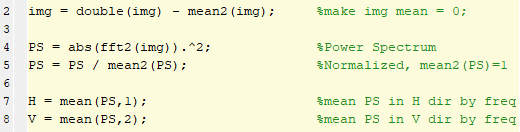
That’s all there is to it, the rest of the work goes into opening a raw file (you can use tools like dcraw, LibRaw or RawDigger for this) and displaying the results in pretty graphs. You can find a link to the full function I use at the bottom of this page.
Let’s then take a look at an example based on a Nikon Z7 dark field.
Bayer CFA and Color Planes
Digital cameras today tend to detect color by placing color filters on top of sensor pixels. The most common arrangement of color filters relies on just three filters – one each for the approximately Red, Green and Blue wavelengths – applied to pixels in a repeating pattern of four comprising a quartet:
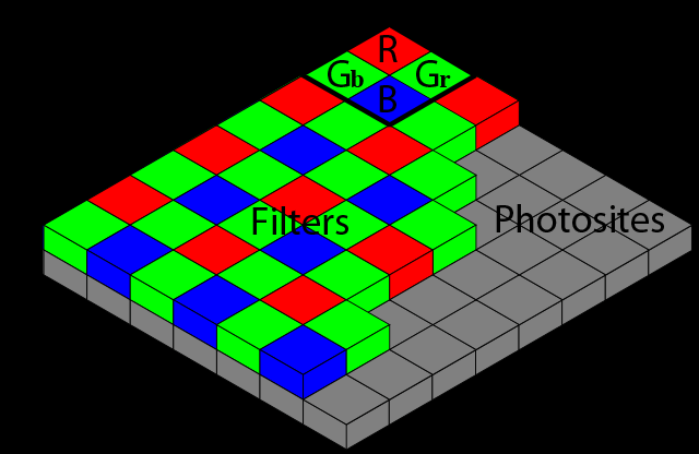
This Color Filter Array arrangement is known as a Bayer CFA, after the gentleman that first proposed it. It is usually qualified by the order of the filters in the quartet as they start at the top left of the raw image, in this case RGGB.
In the discussion that follows I will sometimes separate the full 5520×8288 pixel Bayer CFA raw capture from a Nikon Z7 into four ‘half-sized’ 2760×4144 pixel images – each made up of every other pixel horizontally and vertically, just those under one of the four filter colors at a time (i.e. R, Gr, Gb, B) – referring to each such image individually as the relative color plane.
Noise Character
With no signal, with the cap on, all we should capture in the full raw CFA file is noise introduced by the electronics – and possibly processing performed on it before the data is written to file. Such noise has many components, each with its own character: pattern noise, dark signal non uniformities, thermal noise, telegraph noise, 1/f noise, dark current noise, quantization noise, etc. etc. – many of the darkest secrets of a sensor can be found in there.
In photography we typically collect these various noise sources into two macro categories: those that are random, which we generally refer to as Read Noise (RN); and those that are not, which we generally refer to as Pattern Noise (PN), colloquially also known as banding or striping. If the sensor designers have done a good job, Read Noise will be approximately Gaussian in character and Pattern Noise will be kept under control. We can quantify the amount of Read Noise by measuring its standard deviation, as we have done many times in these pages. An HV Spectrogram on the other hand gives us much information on the character and strength of Pattern Noise.
In the absence of PN, and assuming Gaussian read noise, a dark field image could look like this (red raw color plane only, shown after histogram normalization)
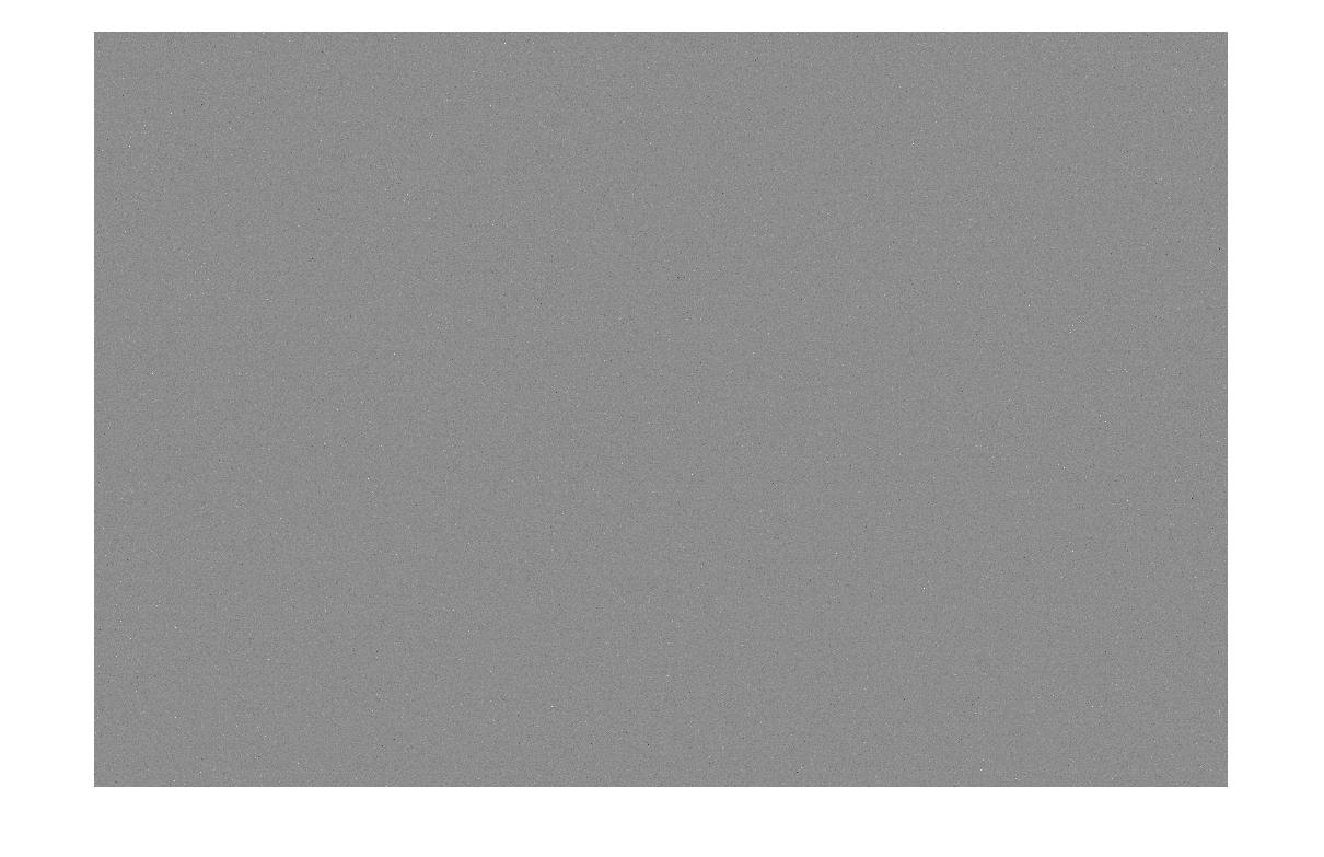
The standard deviation of the data in Figure 4 is about 1.3DN, a typical Read Noise amount at base ISO for a well designed sensor[5] . Since the image looks like white noise, which has roughly the same mean energy throughout the spectrum, we expect the Power Spectrum to also look like white noise – and it does (log2 of PS shown below after histogram normalization):
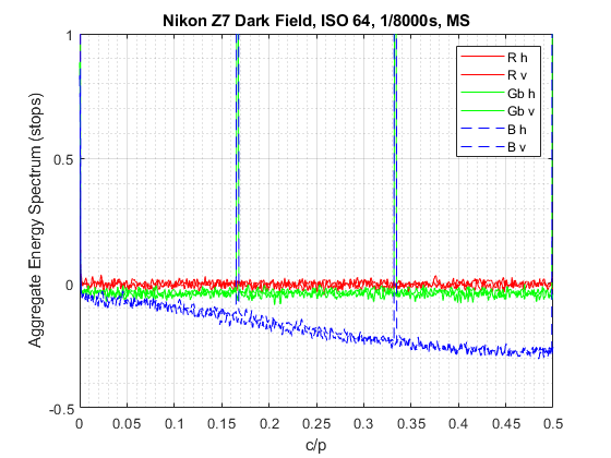
The Plots
The noise of the Power Spectrum image of the red color plane only shown in Figure 5 appears evenly distributed, therefore if we average its every column and every row per the algorithm outlined in Figure 2 the result should be two (less noisy) straight lines. The lines are straight because all frequencies have roughly the same energy in random noise. They are less noisy because they are the result of averaging a column or row of data. And this is indeed what we get from 0 c/p to the Nyquist frequency (0.5 c/p) if we feed the raw Red CFA color plane seen in Figure 4 to the Spectrogram routine, all 2760×4144 pixels of it:
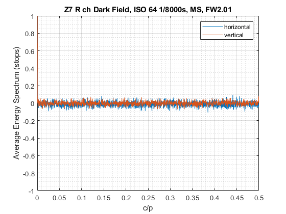
The horizontal axis represents spatial frequencies expressed in cycles per pixel pitch[6] while the vertical axis is relative Energy, expressed as a logarithm of two, hence in ‘stops’.
Interpreting the Plots
Figure 6 depicts the mean Power Spectrum in the H and V directions of the red color plane from the raw capture at the shown spatial frequencies. The Spectrum is noisy but it appears that no frequency stands out obviously, indicating that the noise is random and there is no obvious Pattern Noise. Note also that the output hovers around zero energy in log2 units. That’s because of the normalization we performed in line 5 of Figure 2 above, which makes the average Power Spectrum equal to 1, and log2(1) is equal to zero. The vertical line looks cleaner than the horizontal one because it is made up by averaging rows – and rows have more pixels than columns in this example.
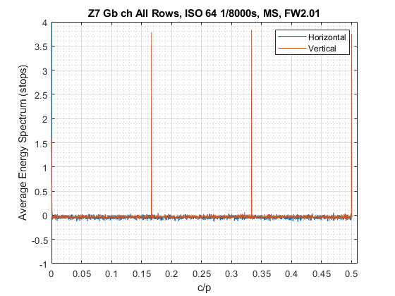
So the Red channel looks pretty clean. If instead we produce a spectrogram of the Blue raw CFA plane only we see a different story altogether (scale changed):
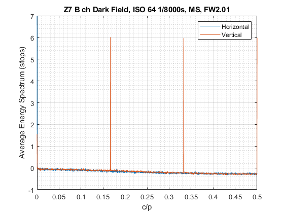
In the case of the Blue raw channel from the same capture that produced Figure 6, three large spikes stand out in the vertical direction only, at 1/6, 2/6 and 3/6 cycles per pixel. The sharpness of the spikes means that there is a very well defined repeating pattern, the pattern apparently repeating in cycles of 6, 3 and 2 pixels vertically (pixels/cycle, the inverse of cycles per pixel).
It turns out that the Nikon Z7 Bayer CFA sensor has a row of specialized pixels different from the rest every 12 rows. These so-called PDAF rows are made up of alternating green (Gb) and Blue (B) pixels and are used for autofocus phase detection and metering. Because B pixels occur every other row on the sensor, that corresponds to every 6th row in the relative CFA color plane – and that’s what we picked up here. The second (2/6 c/p), third (3/6) and higher harmonics may indicate repeating patterns at those frequencies or may be a product of the math, we’ll discuss it further below in the Harmonic Duality section.
We also note that the other frequencies present in Figure 7 do not seem to have similar energy throughout the spectrum, but instead droop as they increase. This is an indication of some sort of processing, resulting in a low-pass filtering effect.
Because the linear data is normalized we know that in any case the mean energy shown throughout the plot necessarily averages to a value of 1 (zero stops in the plot), so in the end the energy in the spikes and in the droop needs to cancel out. In the linear domain we can say that the areas above and below the mean value of 1 will always be the same (in the log domain it is similar but it does not quite work as neatly visually around zero),
Diving in on Processing
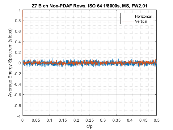
Out of the Blue color plane we can pick every sixth row and therefore feed just the PDAF Blue pixels to the routine to obtain this plot (note the change of scale):
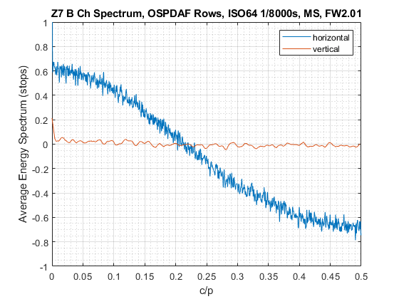
Now all pixels under analysis should be uniformly of the same type so we would ideally expect to see flat spectral lines. However that is only true in the vertical direction. In the horizontal direction we clearly observe the signature of non-linear processing on a random signal: decreasing energy as frequency increases indicates low-pass filtering.
If we perform the same exercise on all non PDAF rows in the Blue plane only we obtain straight lines (Figure 9 below, similar in fact to the R and Gr color planes as well). This means that Nikon performs a 1D operation on just the Blue pixels in PDAF rows only, line by line, before writing the relative data to the raw file. Noise reduction at base ISO? Perhaps, after all if reporting is correct such pixels are partly masked, therefore receive less light – and the Blue channel often receives less than the others to start with in typical low-light shooting conditions.
Note also that there are no obvious spikes in Figures 8 and 9 above 0 c/p, nor are there any in the non-PDAF rows and in the R and Gr color planes, so the only relevant Pattern Noise present at base ISO seems to be the discontinuity created by having a different pixel type every 12th row on the sensor (every 6th row of the individual color planes).
Harmonic Duality
So if in the B color plane the only repeating pattern was the row of PDAF pixels every 6, where did those spikes at multiples of 1/6 c/p in the relative spectrogram in Figure 7 come from? A hint may come from noticing that they all seem to be about the same size, Fourier math to the rescue. A delta train every  pixels in the spatial domain transforms into a delta train (or
  ) every 1/ cycles per pixel in the frequency domain as follows:
(2) 
The in the spatial domain here is caused by a bed of normal pixels interleaved with different PDAF pixels making up the entirety of just rows 3,9,15,21 … every 6 rows, 460 of them, all the way to the bottom of the plane. In the frequency domain this gets transformed into a with peaks at 1/6,2/6,3/6,4/6 … every 1/6 c/p all the way to 1 c/p (as we have seen up to Nyquist in the vertical direction; in this instance there is no pattern in the horizontal direction). Since we have ascertained that there are no other patterns coincident with those frequencies, we can now confirm that the higher harmonics present in Figure 7 are just due to the train of one PDAF row every 6 in the color plane (every 12 on the sensor).
The Green Color Plane in Blue Rows
Bayer CFA sensors are laid out in alternating rows of R/Gr and Gb/B color filters as shown in Figure 3, there are therefore two Green color planes, one associated with Red pixels, the other with Blue ones. Let’s take a look at the Green color plane associated to Blue pixels (Gb) to see if they also come in two types (change of scale to capture the spikes):
Yep, we pick up the PDAF pixel type change every 6 rows on the Gb plane as well, though the spikes are about four times less energetic than in Figure 7, indicating that perhaps these Green PDAF pixels are not as different from the standard type as the Blue PDAF pixels are, since all else should be the same. This time there is no sign of a droop, however, suggesting no filtering in this plane. I can understand why Nikon may not feel the need to filter the Gb channel: there is generally more light intensity in the green band in normal conditions, plus we have another fully dedicated green pixel plane without any PDAF pixels (Gr).
The PDAF Rows
Next I am going to show the spectrogram of data from PDAF rows as they come off the sensor, before separating them into color planes, therefore with alternating Gb and B pixels inline, all 460×8288 of them

There is a strong peak in the horizontal direction at 0.5 c/p (a cycle every two pixels), indicating the fact that in PDAF rows low-pass processed B pixels alternate with unprocessed Gb pixels and in fact we suspect the two pixels to be slightly different. The algorithm detects this mixed processing in the horizontal direction and represents it as shown. The curve is noisier, because there are fewer, less uniform, pixels to average.
The vertical spectrum curve is instead clean, suggesting no pattern noise and no processing in that direction in PDAF rows, as we had seen before by looking at the individual channels. It presents mostly at less than zero energy (in stops) because, thanks to the earlier Power Spectrum normalization to one (zero in log space), it needs to average out the energy above that observable at the lowest frequencies near zero, probably due to slight gradients induced by bias, amp glow or similar low level sensor-wide effects.
All Together Now
Finally, a spectrogram of the full CFA raw capture, 5520×8288 pixels as they rolled off the sensor and were stored into the raw file after minimal massaging. This is actually the plot I produce first when investigating a dark field:
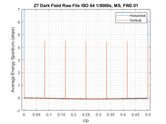
Here we can see all of the features that we observed in isolation earlier: the repeating pattern every 12 rows in the vertical direction and related harmonics, the processing droop and the spike at 0.5 c/p in the horizontal direction due to the different Gb and B pixel treatment in PDAF rows. At this high level we are just getting a watered down milkshake of the various effects present in the noise. It is our job to drill down and isolate each of the ingredients in order to properly characterize and measure them, a job made easier by tools like spectrograms.
A copy of the Matlab function used to produce these plots can be downloaded from here. The routine allows for smoothing of the Power Spectrum if the resulting curves are too noisy. None of the plots in this page were smoothed.
Post Scriptum
Should anyone be interested, the behavior of the Nikon Z 7 at ISO 800 is similar, with just the Blue channel PDAF rows showing signs of horizontal filtering. Of course the data is noisier at ISO800 than at 64.

Notes and References
1. Jim Kasson produces similar plots, for instance here. The principle is the same, though Jim may use slightly different normalization parameters so the energy scale may also be a little different.
2. DSPographer’s seminal work on noise spectral analysis was captured in this fascinating DPReview thread.
3. Though the two are often used interchangeably in digital signal processing, in imaging we are really dealing with the Energy – as opposed to Power – Spectrum. You can find its definition here for instance.
4. Parseval’s Theorem is described in this Wikipedia article.
5. A well primed ADC requires random noise of at least 1 ADU at its input for proper dithering, see for instance here.
6. You can find a description of the units of the spectrum in imaging and how to convert between them here
7. The Matlab code used to produce the plots in this article can be downloaded from here.
Everything is very open with a clear description of the challenges. It was truly informative. Your site is useful. Thank you for sharing!
You can also have a look here –> https://github.com/Christoph-Lauer/Sonogram
Looks very nice Christoph